
On recent Mercedes-Benz dashboard designs
Mercedes (is it ok if I call you MB?), I think we need to talk. You’re doing great in Formula 1, congratulations on that! That said, you’ve gone in a weird direction with your passenger car dashboards. I suspect there are five different teams competing to win with these dashboards and I don’t think anyone, especially this car enthusiast, is winning overall.
Here’s your current entry-level SUV, the GLA. If my eye is correct, this is one of your more dated dash designs:
[caption id=“attachment_3827” align=“alignnone” width=“634”]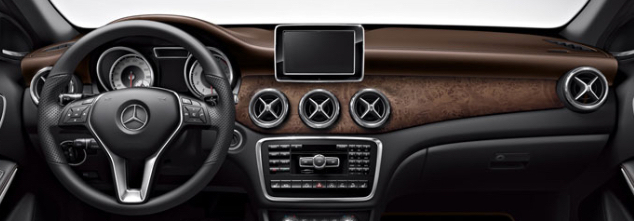 All the buttons![/caption]
Back in the day, I think, you had someone on staff at MB whose primary job was to make sure your dashboards had at least 25 buttons on them. This was probably a challenging job before the advent of the in-car cellular phone. However, once those became common, that was 12 easy buttons if you just throw a dial pad onto the dash. And you did!
So it’s easy to identify this as an older design from the dozens (43) of buttons. But the age of this design also shows from the LCD. One, it’s somewhat small. Two, and more glaringly, you simply tacked the LCD onto the dashboard. What happened here? Did you run out of time?
I think you can do better. The eyeball vents are nice though!
Now let’s look at a slightly more modern, and much further upscale, design. Your AMG GT coupe:
[caption id=“attachment_3828” align=“alignnone” width=“673”]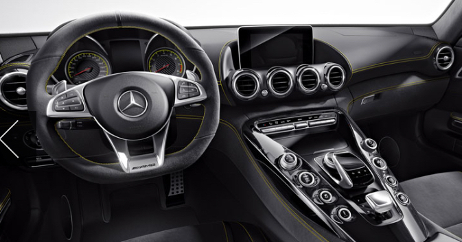 All the suede[/caption]
OK so you lost most of the buttons in favor of bigger, chunkier buttons. That’s good! You also made a little scoop in the dash for the LCD. That’s progress, but the placement still feels awkward. I know that’s where all your luxury car friends put the LCD now, but you’re so dominant in F1, maybe you can do better here too?
Can we take a moment to talk about the interactions a little? Your take on the rotary control is a little weird. You’ve got one, and it’s got a little hand rest on top of it. That seems good. But then the hand rest is also a touch interface for scribbling letters? Seems weird! I’ve never used that, but I’m a little skeptical.
Next, you’ve gone through some weird stuff with your shifters. You had a really lovely gated shifter on the S-class couple as long ago as the early 90’s! Lately you’ve tried steering column shifters, and now it seems you’ve settled on a soap-shaped chunk of metal that you move up and down to change directions and put it in park. I feel like you should give up the physical shifter thing and just go with (you’re gonna like this) more buttons.
My parting thought on the GT’s interior is this: width. Your designs impart a sense of tremendous girth in the dash, making the car feel bigger. We’ll come back to that immediately…
Finally, one of your most recent designs, the E-class sedan:
[caption id=“attachment_3829” align=“alignnone” width=“867”]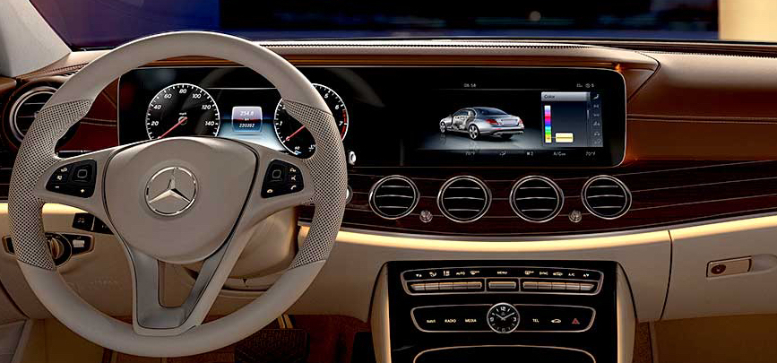 All the pixels![/caption]
Again with a regal sense of width. Personally, I don’t like it. It makes your car seem like a giant sofa.
You are making great progress on reducing the number of buttons. Again, kudos.
OK, clearly you got a great deal on LCD panels. Plus, an almost equally good deal on eyeball vents. Good for you!
Also you put an analog clock on the dash. So that’s nice.
I don’t think we’re going to like this giant piece of software and glass thing for very long. Did you see Her? There are hardly any displays in it. All the computers are somehow inhabited by the characters, either by talking to them or interacting within a projection. Why take one of your classic instrument clusters, make that an LCD, and occasionally project information onto the windshield if the driver or passenger needs to see it there? Just a thought!
I’m a little split on the design of your wheel there. It’s nice that technically it’s a 3-spoke design but really, if you count, it’s 4 spokes. The lamest number of spokes. Perhaps with the split you were trying to add more negative space and perhaps evoke a very old, SL-like 2-spoke design? That’s a nice gesture, but I think you missed here. Surely you could engineer a straight-up 2-spoke wheel?
In summary:
- fewer buttons, less noticeable screens, more seamless interactions
- a few retro design elements (eyeball vents, analog clocks) are great, too many is too much
- reduce your five design teams (screens, buttons, wheels, interactions, A/C) down to two: driving interactions and auxiliary interactions
Hope that helps!